Commentary on the Stock Market, Economy, and the CrystalBull Indicators
The purpose of this Commentary is not to provide a daily update of financial news, but to provide an analysis which may not be otherwise available in the media, or to notify users of important aspects of our models or data. We will post here when we feel new information is worthy of your consideration.
< Recent Commentary available to Subscribers only. >
Older Commentary:
May 27, 2026 We have added an individual stock screener to our site!
Each week, we scan the universe of U.S. stocks, and use AI find those with the best fundamental and technical characteristics for your review. These are great growth stock candidates for those who like to pick individual stocks. Let us know how your picks performed!
Jan 27, 2025 Exciting news! Our founder, Ken Simpson, has published an incredible book: DO-GOODERS, available on Amazon.com. Of course, it's also on our recommended reading list.
This may be the only book you need to read to understand economic policy and predict outcomes. This is not an afternoon read. This book uses charts, data, and historical nuggets, with over 1,100 footnotes and citations, to prove its points. We have always been strong supporters of freedom and free markets. This book explains why so many government do-gooder policies cause unintended harm, and lays out a framework by which government policy can be analyzed. If you truly want to understand bubbles and busts, the money supply, inflation, price caps, cryptocurrency, the New Deal, the gold standard, abortion rights, the minimum wage, Social Security, gun control, and much more, then this book is for you. And, it makes a great gift!
DO-GOODERS started 2025 as the top new release for Libertarianism. It's a must read!
Amazon has a 550-page limit on hardcover books, so the hardcover uses a smaller font and tighter margins. For a more comfortable read, we recommend the paperback. It is 763 pages.
Jan 6, 2024 We have added a new indicator to our Dashboard: Initial Jobless Claims. When the monthly Initial Jobless Claims falls below its 3-month moving average, that is generally a bullish signal for the economy. Conversely, a rising Initial Jobless Claims reading is bearish. You can study the relationship of Initial Jobless Claims to the S&P500 at our Initial Jobless Claims chart.
Sept 30, 2022 We have updated our spreadsheet comparing a median-income worker's private retirement account to their Social Security benefits. Each year, the results get more troublesome. A median income worker, retiring today at age 67, would have over $4 million in their retirement account, had they been able to invest the FICA taxes withheld in the S&P 500. You can enter your own FICA withholdings each year to see how much opportunity was lost due to the Social Security program: Social Security Privatization Calculator
Sept 20, 2022 We have updated our review of Investor's Business Daily's Market Pulse as a market timing indicator. Nine years ago, we predicted this indicator would fail, and we were spot on: IBD Market Pulse Review
Jun 30, 2022THE BRIGHT SIDE. The first half of 2022 is in the books, and it was the worst start for stocks in over 50 years! However, all of our models have beaten the market YTD, with the exception of our Macro Indicator, which has seen enough macro strength to remain long all year.
Be sure to check out our Model Returns page, where you can download CSV files for each indicator. Happy returns!
Nov 28, 2021 Introducing our newest model: The Vixen™! The Vixen is not for everyone. It trades the VIX volatility index, which is extremely volatile. Therefore, this model can have very large drawdowns. Precautionary principle means this strategy should not use more than a very small portion of a trader's equity, as the risk on each trade is high. But the backtested returns of this model were so astronomical that we thought it is worthy of consideration.
Click here to see the backtested results of the Vixen, trading the VIX index using a long/short strategy: CrystalBull Vixen™ History Chart
Yeah, it's insane. We'd love to hear your comments.
March 10, 2021 We have updated our Social Security Privatization Calculator, using the latest income figures from the US Census Bureau (2019). Plug in your own figures to see what your Social Security contributions have cost you. You will be surprised.
January 31, 2021 Great news! We have updated both the Matador™ and Trading Indicators, accounting for new data points revealed in the selloff of 2020. During the panic of Spring 2020, our indicators were at programmed limits, entering territory not seen in history. We have tested and found new limits, and installed these in the models. So, how did these changes affect performance?
Click here to compare the updated models' performances versus previous versions.
We are excited to see how these minor tweaks perform going forward. As always, your questions and comments are welcome.
December 9, 2020 Fun fact to share with your friends: 42% of all US Dollars in existence were created by the Fed in 2020. This, more than any other reason, explains the current bull market in assets: stocks, real estate, commodities, cryptocurrencies, etc., and deserves far more attention than our media are giving it.
The Federal Reserve balance sheet grew 73% in 2020! This is truly hard to believe. Please tell a friend.
July 3, 2020 Introducing our new Machine Learning Stock Market Prediction Experiment! Evolution has given humans incredible pattern recognition
capabilities. Those abilities have enabled us to survive and thrive in a world of danger and chaos. We can recognize a rustle in the bushes in our periphery, the threatening look in the eyes of a
predator, or the alluring aroma of Grandma's apple pie. But, our pattern recognition does have its limitations, especially inside complex, multi-input, and obscure scenarios. Enter modern machine
learning. While humans can process only a handful of complexities at a time, modern computers welcome countless. Through an ingenious process of mathematical curve-fitting, modern computers finally have
enough power to tackle even the most difficult pattern-recognition problems. Linear algebra? Tensors? Large matrices? Piecemeal curve fitting? Let the computers do the work.
If a valuable pattern exists, a well-developed machine learning algorithm should be able to discover it.
We have invested a considerable amount of time over the last few years developing and training this model. In order to take advantage of frequent compounding, we decided to try to simply predict tomorrow's trading
range, perhaps extracting a fraction of a percentage gain each day. We have tested many different data inputs, discarding those that seem to be mostly noise, while keeping those that add signal.
While this is still a work-in-progress, we thought we'd share what we have to this point. Follow along as we continue to develop this model. As always, we welcome your questions and comments.
And, be sure to show your friends!
March 27, 2020 What have we been up to? Since May, 2019, we've been working hard to give our Trading Indicator a faster response time.
While our Trading Indicator has found some remarkable market signals, on several occasions it was unable to respond quickly enough to signal the other end of the trade. In other words, while the market may
have bounced off our signal (we have seen this many times!), the market again turned around, and the Trading Indicator was too slow to respond.
We have run, literally, billions of tests, trying to develop a faster response time for the Trading Indicator. What we have found is incredible, and we cannot wait to share it with our subscribers.
However, this updated model trades more frequently than the previous Trading Indicator. It is now VERY fast. In fact, it may even reverse itself intraday. So, it may not be suited for some of our
subscribers. For that reason, we have decided to launch the update as an entirely new indicator.
Introducing the CrystalBull Matador™! The backtested results from this new model boggle the mind. We have never seen any model which rivals this. (Yes, of course, it's overfitted to past
history, but if you were able to see the data science inside the model, we are sure you'd be impressed.) It even extracted gains during the recent Coronavirus selloff. Be sure to give this new model
a study, and see if it would fit into your trading routine.
Here is a comparison of the backtested results of the Matador™ compared to all previous versions of the Trading Indicator: Matador Performance
NOTE: Because the Matador™ may reverse itself intraday, we are currently sending only one intraday alert per day.
We are excited to finally be able to release this updated model, and we're anxious to see it in action! Please let us know what you think!
May 6, 2019 Something a little different to share... Income and Wealth Inequality will prove to be a huge issue in this election cycle.
We thought we'd take a deeper dive into the data, in search of possible solutions. Turns out, most of the narrative about income inequality is based on myths. Let's dissect this in this video:
Income Inequality - Part 1 - Correcting the Narrative
May 6, 2019 A person would think that a "hugely successful international businessman" who "went to the best schools" would have paid import duties
in the past. Someone please tell President Trump that these tariffs are paid by the importer, who passes it on to US consumers. Tariffs are not paid by the country of origin. They are paid by
the company or person who imported the goods, at the port of entry, before they are delivered.
President Trump also, sadly, does not understand what trade deficits are. We all have trade deficits with our local supermarkets. Is the supermarket stealing all our money? No! They
spend it elsewhere in the economy, perhaps to our employers. China does the same. They don't have dollar bills stuffed in warehouses. They may buy US Treasuries, or real estate, or tech
companies, but the US Dollars do get spent in the world economy. President Trump, please follow the path for those dollars as they make their way back to US shores.
The unintended consequences of your actions are doing damage to many.
Aug 8, 2018 We've been busy! For months, we have been crunching numbers, searching for a better model of macroeconomic effects on stock
market prices. And we've created something we believe is rather special: the new CrystalBull Macroeconomic Indicator.
This is quite possibly the best macro indicator available anywhere. And just in time! There is much abuzz in the markets about rising interest rates, inverted yield curve, tax cuts, tariffs, inflation,
employment, time since correction, etc., while the market continues to climb its "wall of worry". Pundits are predicting a market top and possible collapse. Our Macro Indicator is telling us that a top
may be coming, but there is still gas in the tank. Follow along and see if this new indicator can spot the next bear market. As with our other indicators, subscribers will continue to receive alerts as
to changes in the model's position.
Please, tell your friends!
Mar 1, 2018 We have had several recent inquiries from subscribers concerned that the Trading Indicator was broken, as it languished near the zero line for the last week. No, the model is not broken. It has been telling us that it could find no clear market direction, or that bullish inputs have been countervailed by those bearish. Indeed, that is what we observe. A 40% reduction in the federal income tax rate for corporations (shareholders) is VERY bullish. That takes capital away from the wildly inefficient federal government and keeps it in the most productive hands in history. (Budget deficits out of the scope of this commentary, for now...) However, proposed tariffs are crony-capitalism at its worst. Anti-free-market measures hurt economic growth (read: humanity). While tariffs may help the chosen ones (temporarily), they adversely affect many more. Most tariffs are just idiotic, one-layer-deep thinking. Add this to the chaos inside the White House, Congress, the Fed, the FBI, and the media, and it is no wonder the markets are confused, and volatility has returned. And, it seems the interest rate party may be coming to an end. Eventually, these trillion-dollar deficits are going to matter, and interest on the debt is going to pinch.
As of this writing, the market is tanking (our Trading Indicator remains comfortably out of the market), and has crept back up to the warning track:
Historically, such signals quickly turn to oversold, as the weak hands are flushed out. This could happen as early as tomorrow, or perhaps Monday. The more risk averse may wish to wait until the dust settles. Hopefully, next week, but the animal spirit freneticism is palpable.
Jan 5, 2018 For the most part, we are pleased with how well the model performed in 2017. It made some incredible calls, many times hitting the exact inflection points for the market. Most of the intraday oversold alerts were terrific, with the market quickly bouncing back from the alerts. However, many of the overbought alerts were early, with the market continuing higher. This continues here with our first alert of 2018. This tells us there is a very strong upward bias to the market, and that we should be more bullish. This writer is using the overbought alerts, not as a signal to sell directly, but as a signal to use or tighten trailing stops. We have learned in the past not to be too bullish after an overbought alert. One of these days, downward pressure will return.
A buy and hold strategy beat our model for 2017, as the market moved up in a nearly straight line. That is pretty difficult to beat. But, we hope our subscribers still received value from the signals. We captured a sizable chunk of the market returns, while only being in the market 59% of the time, thus greatly reducing our market exposure (risk). That counts.
Here is a chart of the model's 2017 equity curve:
Here's to a profitable and healthy 2018!
Apr 24, 2017 Subscribers now have the ability to ping our servers for live readings of our Trading and Trend Indicators. This can be useful for trading platforms and spreadsheet analysis. We have always offered direct access to these readings via the gauges (e.g. https://www.crystalbull.com/gauge/ ). But now, your data platforms can use our API to obtain a direct numerical reading for each.
Feb 14, 2017 Well, 2016 was a tough market to beat. Our model outperformed the S&P 500 solidly for most of the year, but the Brexit surprise cut into our lead. We were safely out of the market when the Brexit pullback looked ominous. But, the model missed the immediate recovery coming out of the Brexit pullback (which also surprised most stock market advisers and hedge funds). We again outperformed the market in the last 4 months of the year, but ran out of time before we could regain the lead.
To get a better idea of how our Trading Indicator performs in various markets, here is a chart over the 2015-2016 period:
As we have stated in the past, it is difficult to beat a market moving up in nearly a straight line, especially using a 1x (beta 1.0) long-only model. But, we had some great calls along the way.
In our June 8 tweet (shown below, in the Jun 15 commentary), we correctly identified a minor top on the 2016 run up. That was to the penny, and Brexit soon followed. We are aware of no other stock market service who made such a call at that time; All we saw were extremely bullish.
And, while we're at it, here is a tweet we sent out notifying followers about inflection points in our Calendar Indicator. From April 25:
CrystalBull Calendar Indicator sees turmoil for 2 months prior to election. Then, relief. pic.twitter.com/x2pXQ9a4Fu
We have been in the market for most of the current rally, and look forward to exiting on strength, before the market decides to take a breather. Subscribers, be sure to follow our Intraday Replay Chart, to see how the Trading Indicator model has reacted to current market conditions.
Jun 15, 2016 Yes, we tweeted this on June 8, and the market promptly sold off into Brexit:
May 26, 2016 This is what a great timing model looks like:
Apr 20, 2016 The new Trading Indicator model update is in, and we could not be more excited. We have had the opportunity to capture more data from the recent market drawdowns, which has allowed us to find more actionable points in the model. (We had not found any significant improvements in the model since 2013, so this is a big deal!)
We had set out to determine if we could find any data that would allow us to have exited the market before the August, 2015, and January/February, 2016 pullbacks. While we were able to adjust the model to have avoided one down day in the August pullback, this same strategy allowed us to improve the model over most periods of its history. These improvements increase the backtested performance by a noticeable amount, over the entire model's history, as you can see by clicking the following link. We have provided this study, to allow you to visualize the improvements to the total return of our Trading Indicator, for all of our last 6 models:
We think you'll agree that this is a compelling improvement, and pushes our Trading Indicator model closer to its theoretical performance limit. It's a beautiful thing.
Apr 17, 2016 The market continues to bounce off our intraday alerts:
Jan 5, 2016 We won. We are normally humble and quiet, but, while still reveling in the new year, we are going to take a victory lap here. 2015 was a difficult year for most investors. For the seventh year in a row, most managed mutual funds failed to beat the market, and most of those lost money for the year. And, once again, the average hedge fund lost money in 2015. And that only counts the hedge funds that survived. Was there a port in the storm? While it sure would have been nice to have been out of the market during the August mini-crash, the CrystalBull Trading Indicator model still beat the market solidly, gaining more than 9% against (14.84% backtested with newest model) a gain in the S&P 500 of just 1.21%, including dividends. Yes, we worked hard for that gain, but we'll take it.
The market has a way of humbling even the most careful investor. We know not what 2016 will bring. But, we have studied every indicator and data set we could think of, and have never seen a better stock market indicator than our own Trading Indicator. We have no way of knowing if its performance will continue, but we always want to be riding the strongest horse. We hope you've found the Trading Indicator to be a useful tool, and that it continues to pull signal out of all the chaos.
2015 did give us a few more data points to test. We will be spending the next few weeks trying to see if we can find any improvements in the model. Here's to a healthy, happy, and profitable 2016!
Jan 4, 2016 Did your new year's resolution include becoming a smarter money manager, or studying and learning new ideas? We have compiled our own recommended reading list. These are real gems: Book Recommendations for Investing, the Stock Market, and Life.
December 8, 2015 We are frequently asked, "Can you run a backtest of the CrystalBull Trading Indicator against the Nasdaq, or the Dow, or XYZ individual stock?" Well, here is a study.
December 4, 2015 We continue to be amazed by the CrystalBull Trading Indicator, which pulled an "oversold" signal out of a depressed market, and re-entered at yesterday's close. That was good for a 2.05% gain, in one day. We'll take it. But, the question remains, "Why was the market so strong today?"
All day, from every media source, we heard, "The market is making solid gains today, in response to a strong New Jobs report." But, is that really the reason? We think not. If it were, then we would be in a "new, new, new normal".
The Fed has distorted the free market with its Quantitative Easing (QE) and Zero-Interest Rate (ZIRP) policies. What evidence do we have for this distortion? For the last 2+ years, the Fed has been threatening an interest rate increase. At each time, when an increased seemed imminent, the market sold off. Rallies occurred whenever bad economic news was delivered. This is exactly the opposite of how a market should behave. The stock market is supposed to value itself as a discount of future earnings. Strong economy? Market should rally. Weak economy? Market normally falters. Again, we have witnessed the opposite behavior, and have pointed this out several times over the last few years. So, unless this is a turning point in current market behavior, we'd better take a closer look at that jobs report:
The market rallied today, not because of a strong jobs report, but because the market was oversold, and the jobs report was just mediocre. A mediocre jobs report leaves a small window for the Fed to leave interest rates unchanged at their next meeting. A September survey of FOMC participants, along with recent Fed chatter, tells us that we should expect the Fed Funds target rate to increase 0.25%, with a target of 0.25-0.50%, at this next December meeting. We don't think the economy is strong enough yet to start raising rates. A quarter percent increase is typical, and, though unlikely, it would be much better to see something on the order of one-eighth percent, just enough to warm up the frog before he jumps out of the pot. That would be more of a psychological move than forceful, but the market will not be pleased to see the punchbowl leaking. Many would breathe a sigh of relief that the Fed did not raise by the standard 0.25%. The market is jittery, and the Fed knows it. Now, about this jobs report...
During the month of November, total non-farm employment increased by 211,000. That's not a terrible number, but it's not a great number, either. It's less than the 298,000 created in October, and pretty close to its 3 month moving average. It is plainly mediocre. Manufacturing jobs were flat, while Retail, Health Care, and Hospitality had nice gains. Temporary help (the first to go) had a notable decrease in jobs. Housing Construction specialty trades accounted for 26,000 of the new jobs. The Fed knows that, if we have the sizable winter expected, many of these contractors will be sidelined for a few months in the first part of 2016, so they might be patient with any rate increase this month. Average Weekly Earnings actually fell in November. The unemployment rate remained unchanged. That is hardly the sign of a robust jobs market, and certainly not indicative of any inflationary wage pressure. Were New Jobs to have increased at more than 250,000, with wage gains, and a 4.8% unemployment rate, the market would have, most likely, sold off today.
In summary, the market did not rally today because of a strong jobs report. Contrary to today's media message, it rallied because of a mediocre jobs report, which gives the Fed no compelling reason to raise rates this month. Given the Fed mandate of maximizing employment within their stated 2% inflation rate target, there is little reason to raise rates this month. Ms. Yellen, et al., it would be more prudent to wait until Spring.
NOTE: For a few days, as a marketing test, we are opening our new "Intraday Replay" feature to non-subscribers. Please message your friends to tell them to come see what we're doing here, and how the Trading Indicator performs: https://www.crystalbull.com/trading
November 13, 2015 New feature for subscribers! You are now able to see how the Trading Indicator behaved, on an intraday basis, over recent days. Mouse over the chart, and see how the Indicator responded: Intraday Replay chart
Sample video (click video to play):
November 3, 2015 After a very strong October, the CrystalBull Trend Indicator has again entered positive territory, though it remains near zero. This market may continue to bump its head along this trend line. As noted in our August 31st commentary, the Trend Indicator helps to protect a portfolio during long-term bear markets, but for shorter pullbacks, the model typically re-enters the market at higher levels than where it exited. This is true of all trend-following models, and was the case here. When an investor chooses to evade drawdowns by following the trend of the immediate past, he or she will, by definition, miss the beginning of every new trend. Risk aversion certainly has its benefits, but can come with a tradeoff in short-term returns. The Trend Indicator has participated in the raging bull market since August, 2009, exiting for only 10 of the 75 months, each time during a pullback. See chart
The CrystalBull Calendar Indicator has also re-entered the market here. The Trading Indicator remains out of the market, waiting patiently for a better entry point.
October 9, 2015 Stop losses are mandatory in any trading strategy. But, where do you set them? We've created this unique new utility, which performs the calculus to help find the optimum stop-loss and profit-taking percentages for your given strategy, assuming your strategy has price targets.
August 31, 2015 As anticipated, the CrystalBull Trend Indicator detected a possible long-term trend reversal, and has exited the market. Studying the Trend Indicator chart, we get an idea why this was anticipated, and how this indicator has reacted during previous pullbacks:
The goal of the Trend Indicator is to stay out of the market during longer-term pullbacks. This Indicator has helped to reduce drawdowns, which has its own benefits. For long-term pullbacks, the model remains out of the market, preserving the model portfolio value. However, when the pullbacks have a shorter timeframe, the model typically re-enters the market at higher levels than where it exited. We are not allowed the benefit of foresight to know just how long a pullback may last, so this is not fool-proof. As examples, consider the last 4 round-turn trades in the Trend model:
As stated in the previous Commentary, it is not unusual for the Trading Indicator model to make short-term trades while the longer-term Trend Indicator model is out of the market. As always, each investor must make his or her own determination as to their own risk tolerance.
We should also note that our Calendar Indicator exited the market on July 31st, and will not re-enter until November 1st.
August 26, 2015 Panic, Fear, and Loathing. What is happening to the market, and why has the CrystalBull Trading Indicator been stuck at near-zero for the last 4 days?
First, the model is not broken. It was designed with built-in limits, based on past data ranges. In the last few days, at least one data input exceeded its limit. The model has not been able to measure whether the market was overbought or oversold. It was as if the model was telling us that the market has an equal chance of going higher or lower, which describes its recent action perfectly.
The market has its way of humbling even the best of investors. While this selloff has taken some of our hard-earned gains, the model is still beating the market year-to-date. We hope that continues to be the case, but please consider using stop-loss orders to protect your capital.
What we have seen is nearly unprecedented. The market panicked, leading to a severe, unforeseen selloff. Margin calls went out late Friday, leading to a further selloff Monday morning. Margin debt has been at a record high. Selling begat selling. Panic ensued. This amount of panic is rarely seen, except in crashes. We continue to believe that US companies are still relatively healthy, and such panic is an over-reaction. We are hopeful that the market will calm down to reasonable levels of fear and optimism. We suspect that investors who sold into the panic early this week will be buying back at higher levels, while the Trading Indicator has remained in the market.
If there is a silver lining to this extreme market reaction, it is that it gives us an opportunity to test new data points. The model has done remarkably well this past year, finding overbought and oversold conditions better than any other indicator we've seen. So, we had not intended to adjust any parameters this year. But now, we intend to retest the updated data, as soon as the dust settles. Stay tuned for that update.
On a related note, the CrystalBull Trend Indicator is likely to exit the market when the month-end data are received, seeing a possible long-term trend reversal, or market top. It is not unusual for the Trading Indicator to find short-term oversold conditions within a longer-term downward trend. Stay tuned.
July 21, 2015 CrystalBull.com now accepts Bitcoin! Email us if you wish to subscribe using Bitcoin.
July 21, 2015 We are extremely pleased with the performance of our Trading Indicator during the past year. It has been remarkable in finding market turning points, in the midst of market noise and chaos. On many occasions, the market has bounced right off our oversold or overbought alerts, and changed direction. Even to those of us who have studied and developed the algorithm, its signals have been amazing. Therefore, we will make no mid-year adjustments to the algorithm. We hope the model continues to perform with such brilliant alerts.
April 20, 2015 Subscriber-only pivot points. Recently, questions have arisen about intraday alerts that have not held to the close. We thought a detailed explanation would be warranted here.
The Trading Indicator model is updated throughout the trading day, at 5-minute intervals. If a potentially overbought or oversold condition is detected, subscribers are alerted via email and text. As we have seen, many times the market bounces off these conditions, to the point that the condition no longer exists at the close. The official model, whose historical results are published at the top-right of every page on the site, is based only on conditions and trades at the close of each day. If the condition did not hold until the end of the trading day, the published model takes no action, and remains in or out of the market.
Does this mean that the intraday alerts were faulty? On the contrary, the intraday alerts have many times provided valuable (in our opinion) information about the condition of the market. While the primary purpose of the intraday alerts is to provide a warning to subscribers that the official model may change positions at the end of the day, some subscribers use the intraday alerts to guide their trading decisions. Are the intraday alerts valuable? We'll let you be the judge. Here is a recent chart, marked to show intraday alerts which were hidden from non-subscribers:
Between March 26th and April 1st, oversold alerts were sent out during 4 of the 5 trading days. Was the model trying to tell us the market was putting in a bottom? Remember, this was a period when many were scared out of the market at lower levels, and fled to cash. Financial pundits were screaming, "Fire in the theater!", especially on March 26th, which was the short-term bottom. Did any other models pick up those reversals? While the official model was out of the market from March 18th to April 17th, a nice round-trip trade existed in the intraday sub-model. We'd love to hear your comments.
March 6, 2015 The Curiously Fickle Market. There is no doubt that the Federal Reserve has distorted markets around the world. Some of the distortions, such as in the mortgage markets, have been beneficial. Others, such as the near-zero interest rates paid to savers, have been maleficial. The Fed's "Zero Interest Rate Policy" (ZIRP) has incented savers and bond purchasers to move billions of dollars into the stock market, pushing it to near-record highs. These distortions will not last forever, which is why so many are watching the Fed's every move to try to judge the turning point. Many calls of a market top have been wrong for several years now. The "perma bears" are looking rather foolish, as are most of the surviving hedge funds.
To find proof of this distortion, one only needs to look at today's market action. The monthly New Jobs report, which correlates rather well with the stock market, showed better-than-expected jobs growth. In a normal market, that would have pushed the market higher, as the market is typically a reflection of the overall strength of the economy. But, today, this is not the case. The anticipation of the Federal Reserve's removal of the punch bowl has had an inverse effect on the market. Investors, anticipating the Fed's raising of interest rates, have been selling on good economic news. Curious, indeed.
So, what are we to do with this change of character in the market? The CrystalBull Trading Indicator does not have a Quantitative Easing component. Should we modify the model to add such a measure, thus showing better backtested returns? The answer is most likely "no". This distortion will pass. Adapting the model to account for a fleeting influence would almost certainly hurt returns going forward. And future returns are all that are important. We are not trying to build a model of the past, but we need to use the past to try to build a model for the future. It is a difficult, but interesting, challenge.
The CrystalBull Trading indicator failed to beat the market during QE, but it has done something that is not to be dismissed: Our model has captured decent gains in this fickle market, while being out of the market, in cash, for about half the time. Our market exposure risk has essentially been cut in half. This commenter, for one, would not have had the tolerance to simply sit through all the noise (read: risk) in this market (and the world), and would have been tempted to sell near every short-term bottom, only to buy back at higher levels. Make no mistake, many investors and hedge funds LOST money last year and this, in spite of a market which moved higher. The model provides a methodical, unemotional, time-tested system for trying to capture market gains, while moving to cash during periods which seem prudent. As an example, the model was in cash today, avoiding a sizable loss.
We are ahead of the market so far this year, and hope to keep it that way. Have a great weekend!
October 6th, 2014 Order out of chaos: Today's intraday alert picked the market top TO THE PENNY. The market bounced off the alert, and headed lower. While the stock market appears to be chaotic, frustrating most investors, we are pleased with the performance of the model in continuing to alert us to overbought or oversold conditions. As the market pulled back (giving back all of its gains for the day), the Trading Indicator is no longer in an "Overbought" condition, so the model remains in the market. (Remember, the official model, with its performance shown at the top right of this page, is based only on end-of-day readings and trades.) Will the market march higher to another "Overbought" condition? We are watching closely.
August 1st, 2014 We have just completed Part 1 of our Quantitative Easing study. We expected to find the markings of a bubble ready to pop as soon as QE3
ends. Instead, we found just the opposite: QE Study with charts. Have a nice weekend!
July 1st, 2014 Did you know that when your smart phone or other devices connect via public wi-fi, some apps send packets of information about you, in the background, that are easily intercepted? In light of the growing number of security attacks on users around the world, we have moved ALL of our web page URLs, even those not requiring login, to the secure, encrypted versions (SSL-secured addresses start with "https://"). Any requests to the old "http://" addresses will be redirected, causing a very short delay in load times. Please take a few minutes to change any bookmarks you have to our site (including smart phone shortcuts, RSS feeds, like Google Reader or Apple Reader, etc) to the new "https://" addresses. This helps to protect you, and speeds up your access to our site. Thank you!
Here is a great podcast explaining this growing security issue: Planet Money: Project Eavesdrop. Please pass along to your friends who spend time on public networks.
May 26th, 2014 What is the real cost of your home mortgage, after taxes and inflation? We have updated our True Mortgage Cost Calculator for the most recent 2013 tax code. (The answer may surprise you.)
January 15th, 2014 Fooled by Dividends. Dividends can be taxed at an effective rate of more than 100%, and are an indicator of incompetent management. The explanation is lengthy, and required its own page: Fooled by Dividends
December 5th, 2013 As the vapid economic discussions in Washington, DC wane into theater about the minimum wage, we thought we would prepare this chart showing the Minimum Wage vs. Youth Unemployment, going back almost 60 years. Regardless of what some politicians believe, the laws of economics have not yet been repealed, and higher wages do correspond to fewer jobs.
December 3rd, 2013 We have added a new data set to our stock market indicators: Job Openings. The monthly New Jobs report is widely followed as a leading indicator to economic growth. The Job Openings data may be a precursor to the New Jobs data, and thus, more useful in timing the stock market. While this data set only goes back 13 years, it still may be useful. Be sure to study the new Job Openings chart. Notice the flattening in the rate of Job Openings just before the last market top, and its apparent flattening currently. Is the stock market showing another sign of a top?
November 7th, 2013 Need proof that recent highs are driven by Fed pumping? Only in a Fed-fueled bubble would the market tank after good GDP and jobs numbers. Markets more concerned over Fed tapering than corporate profits. $1 trillion per year in Fed pumping, plus $700 billion in fiscal deficits and we're partying like it's 1999.
September 6th, 2013 Buddhists simplify, and strive to eliminate pain and suffering. Noble goals for an investment strategy. Here are 2 rules to do just that: Trade Stocks Like a Buddhist. Enjoy the weekend.
August 27th, 2013 Just like magic. The market bounced off our intraday overbought signal yesterday, and headed south. The signal did not even remain through the close. Today, the Trading Indicator came within a few points of entering "oversold" territory, right at the low of today's range. We will see what tomorrow holds, but we are quite happy with the performance of the model in these chaotic times, even though these trades are not reflected in the performance results of the model.
July 14th, 2013 Our mid-year updates are finished, and installed on the site. We have re-optimized the coefficients of our Trading Indicator model. These were the first improvements we've found in quite some time. They were minor tweaks, resulting in an average change of the Trading Indicator over the last 10 years of +/- 1.2 points, which tells us we may be on the right track. Very few trade dates were changed, but a couple stand out as noticeably better. For example, in 2011, only one trade changed, adding 0.56% to the model's total return. In 2012, one trade changed: The model's re-entry into the market moved from June 20th to June 25th, adding 3.5% to the total return. We encourage you to inspect the Trading Indicator's historical chart, and zoom in (click-and-drag, left-to-right) to these dates to see the outstanding timing of this indicator. We are encouraged, and happy with the performance of the model, in light of all the turbulence and uncertainty in the market in recent years. Using the model in place during 2012, the total return was 12.0%. Using the updated model, the total return would have been 15.5% (backtested). No changes were found in the model's trades for 2013. We will be using the updated model for the remainder of 2013.
April 24th, 2013 Food for thought... Yesterday, the Associated Press had their Twitter feed hacked, sending out a fake tweet concerning a terrorist act. That tweet went out at 1:07PM Eastern time. During the next 60 seconds, the Dow Jones Industrial Average was down 45 points. Within 2-3 minutes, down 140 points. This is a good opportunity to address a few issues relating to the disadvantages of small independent investors:
1) Are YOU able to react that quickly to market news? The large trading firms will almost certainly beat the rest of us to any significant market changes. Automatic, computerized trading algorithms are able to be triggered instantaneously. The large firms are fighting to leapfrog each other, to be closer to the internet fiber backbone, beating all others by nanoseconds to any trade or arbitrage opportunity. They will always have that advantage.
2) Did you have stops in place? Yesterday was a great opportunity for market manipulators to shake out any positions with stop-loss orders in place. As each stop was taken out, the market dropped further. The manipulators were able to sell their positions, and buy them back within minutes at lower levels. Stop-loss orders give manipulators a chance to lever and add momentum to market drops, creating better buying opportunities for themselves. The point here is that stop-loss orders come with tradeoffs. Were this an actual terrorist attack, which may have caused the market to drop 500 points, those stop-loss orders may have helped small investors preserve some capital. But, those same stop-loss orders present an opportunity for manipulation. Use them with eyes wide open.
We also want to point out that this market drop had, predictably, a sawtooth pattern, reacting quickly, and recovering more slowly. This pattern is found throughout the market (see Unemployment and Capacity Utilization charts, or February's Commentary), and is part of human nature and the behavior of herds. Today's market is nervous.
Finally, we want to remind subscribers of a concern we should all share. Yesterday, following (and unrelated to) the malicious tweet, Charles Schwab's servers (schwab.com) went down, and were still down for many users this morning. A Schwab representative told us that they were victims of a "denial of service attack", where some hackers sent them millions of requests, overloading their servers. When we expressed our concern that a financial firm responsible for over a trillion dollars of customer funds could be taken down by a punk living in his mother's basement, their response was, "Tell that to Bank of America, Wells Fargo, Chase, Capital One, Citibank, and others who have been taken down by hackers recently." Now is a good time to review your brokerage accounts' SIPC and bank accounts' FDIC protection limits. If you are over any limits, please consider spreading your assets among various accounts/firms.
OK, enough gloom and doom. Let's get back to making money! We are quite happy with the last few Trading Indicator signals. The model appears to have been able to make sense of the recent market turmoil and jitters.
February 9th, 2013 MARKET VOODOO, or THE NATURAL MOVEMENT OF HERDS? We thought the follow chart was intriguing. It shows what appears to be a natural movement of the market towards a target, where the previous high, the trend envelope, and the logarithmic spiral (spira mirabilis, and a special case where growth follows the Golden Ratio) all converge. Of course, herds are known to spontaneously change directions, but let's see how this plays out...(continued below)
The New Normal starts in August. By then, the S&P500 may have eclipsed its post-2000 high of 1576. The last stragglers will finally capitulate and jump on the bandwagon, for a brief market surge. But where from there? The forces wrangling this cyclical bull stampede (see chart above) will have run out. In August, we will have a different market, a New Normal, where investors will be searching for direction. We will have 2 more quarters of GDP data, measuring the new post-tax-hike, pseudo-government-austerity economy. Stock prices and business models will have normalized, and settled into a world of chronic 7+ percent unemployment. To where will the herd run? Well, fortunately, we have some time to observe the data before we have to formulate our plans.
Between now and the New Normal, we have a couple of potential speed bumps. In the next few weeks, our feckless US representatives will be pretending to deal with unsustainable government spending. Expect their noise to temporarily frighten the markets. We also have the pestering Eurozone problem still taunting us like a Whac-A-Mole. But, most importantly, all eyes should be on the upcoming GDP announcements at the end of each month (5 announcements and revisions before August). Those will be crucial in determining the direction of the market in the New Normal. The pattern in the chart above expects, and allows for, some noise on the way to the target.
As we come to the end of this cyclical bull market, bumping up against the 1530-1550 target, could the market continue much higher? Yes, absolutely. But, that would require decent GDP and jobs growth, stable low interest rates, and no black swans. Countervailing any growing economy would be the indicated Fed tightening, or Quantitative Extracting, to counter the forces of inflation. We anticipate a flattening of the market trend, and some volatility (the Hopi Indians termed this Koyaanisqatsi) as the market discovers its new trend. Fortunately, US companies have found ways to remain remarkably profitable, even during the recent turmoil. And that profit ultimately drives stock prices.
To where will the herd run? We will be monitoring the data vigorously, but first, let's not take our eyes off the short term.
January 22nd, 2013 Further to our comments on the "Fiscal Cliff" negotiations... Well, because our political leaders have chosen to "punt" on any difficult fiscal decisions, we have officially entered the "Alternative Fiscal Scenario", as defined in the Congressional Budget Office's Budget and Economic Outlook: Fiscal Years 2012 to 2022:
that all expiring tax provisions are extended indefinitely (except the payroll tax reduction in effect in calendar years 2011 and 2012); (* all but >$400k extended)
that the AMT is indexed for inflation after 2011;
that Medicare's payment rates for physicians' services are held constant at their current level;
and that the automatic spending reductions required by the Budget Control Act, which are set to take effect in January 2013, do not occur (although the law's original caps on discretionary appropriations are assumed to remain in place)
The CBO's Baseline had originally projected average annual deficits in the range of 1% of GDP. Under the "Alternative Fiscal Scenario", the CBO projects annual deficits in the range of 5% of GDP. That projection gives the United States a gross national debt of $24 trillion by 2022. Add in the additional debt service, plus the effects of any interest rate increases over the next 10 years, plus any unforeseen black swans: wars, attacks, crises, or bubbles, and the number grows quickly. Let's estimate $28 trillion.
Even with the Obama administration's $4 trillion Framework for Deficit Reduction over the next 10 years (this is highly dubious, with double-counting, static analysis, and questionable assumptions. $1 trillion from lower interest payments on debt? Really?), that still puts the US with a gross national debt of $24 trillion. That's more than $78,000 for every man, woman, and child in the country. A family of four, struggling with the $10,000 balance on their credit cards, has their representatives running up a hidden $312,000 debt behind their backs. And this is dwarfed by the $60-120 trillion in unfunded liabilities from Social Security and Medicare.
Bottom line: When you hear your representatives talking about "deficit reduction" over the next few months, remember that the baseline from which any reduction is measured is incredibly bleak. Even an $8 trillion reduction over the next 10 years only brings that family's portion of the debt down from $312,000 to $300,000. It's a drop in the bucket, and comes nowhere near solving the unsustainable fiscal problem. Solving the problem is too painful, politically, and thus the problem will not be solved. Our debt will eventually need to be monetized. Either directly, by sending newly-printed money to bondholders, or indirectly, via hyper-inflation. Both destroy the value of the Dollar. And when the US Dollar loses its prestige as sole world reserve currency, well, let's just say it's ugly.
Yes, we are eminently premature in our prediction of the fall of the Dollar. For one, most competing countries are in similar situations, so exchange rates may stay fairly stable. Barring other dynamics, though, commodity and asset prices should continue to rise. And currency wars are sure to come. We just want our subscribers to be aware of the dynamics in our future, and to protect themselves accordingly. In our opinion, stashing cash in a mattress is NOT a sane financial plan.
January 22nd, 2013 Follow-up on our November 7th commentary... With the January 1st resolution to the "Fiscal Cliff" dilemma, our politicians found a milquetoast compromise in the dividend rate taxation. For most taxpayers, their tax rates on dividends will not change. For those in the $400k+ income range ($450k for married filing jointly or heads of households), however, their tax rates will be increased. For "Ordinary" dividends, their tax rates will be increased to the new higher rates on earned income. Yes, ordinary dividends paid to top earners in California have a total tax rate of 91.7%. We're not sure how anyone can defend that tax rate. On "Qualified" dividends, their effective tax rate will be reduced to 72.1%: 20% federal income tax, plus 3.8% Obamacare tax, plus 35% paid by the corporation, plus up to 13.3% in state income tax, for a total of 72.1% taxation. Those are confiscatory rates. We are quite sure that few of our politicians understand this.
November 7th, 2012 THE DEATH OF DIVIDENDS / THE RANDIAN RECESSION - Yesterday's US election was monumental. What does it mean for investors? We want to step back and take a good look, so we can make plans today. As they say, "Those who fail to plan, plan to fail."
THE DEATH OF DIVIDENDS: Unless the "Fiscal Cliff" is handled in the next 7 weeks, the income tax rate on dividends will skyrocket, starting January 1st. Dividends will be taxed at 39.6% at the federal level, up from the top rate of 15%, for incomes over $200k for individuals or $250k for married couples. Obamacare tacks another 3.8% tax on those dollars, for a top federal rate of 43.4% taxation. One must remember that the shareholder also paid a 35% tax on these same dollars via the corporate income tax. Thus, the federal government will confiscate 78.4% of every dividend dollar for those earners.
The states also get their cuts. Voters in California just approved a tax increase which taxes dividends at up to 13.3% (for incomes over $1 million. 12.3% for incomes over $500k. 11.3% for incomes over $300k. 10.3% for >$250k. 9.3% for everyone else). That puts the top total tax rate on dividends at an inconceivable 91.7%. Socialism? Well, at 91.7% taxation, what's the difference? A corporation would have to be completely mismanaged (or highly-regulated, like a utility) to pay a dividend. Until this is fixed, dividends are dead.
What to do? Well, first, if your dividend-paying stocks are in a tax-deferred account, you will not notice these increases. Dividends are already taxed as personal income in those accounts, when funds withdrawn. But, the exodus from dividend-paying stocks may make them poor investments in the near term. Your investment adviser should be warning you to sell dividend-dependent stocks today.
THE RANDIAN RECESSION: The forthcoming taxes-on-success will be a drain on the world economies. Many entrepreneurs (and aspiring entrepreneurs) will decide it is no longer worth the risk. These taxes will kill growth. Already today, the US stock market is heading south. Money is flowing into gold, guns, and bonds (all defensive plays). The economy cannot grow when the money goes into defense mode.
THE SNOWBALL: Unless the federal government can get the US debt under control, we will spiral towards a real crash in the Dollar. The US national debt (excluding Social Security, Medicare, pensions, etc.) will hit $20 trillion soon enough. That may be manageable with near-zero interest rates, but will put the annual interest expense at over $1 trillion when interest rates normalize. That is more than we currently spend on Medicare & Medicaid combined, more than Social Security, more than national defense. The debt will compound. Interest rates will need to increase to sell the debt, and the snowball will leave the summit. While we are ignoring the oncoming cliff, the future pain will only get worse. Forward, like Rome!
THE ARITHMETIC: Tax receipts = tax rates x incomes. Raising the top marginal tax rate on the top 2% of Americans from 35% to 39.6% will not bring in anywhere near enough dollars to the US Treasury to plug the $1 trillion annual deficit. There are not enough dollars to tax, especially with falling incomes. Many Americans will restructure/simplify their lives to make sure their incomes do not exceed $250k. Income is the vital part of this equation. Because growth compounds, it has a far greater impact on tax receipts than does changing the top rate a few points. To ever have a chance of balancing the budget, we need economic growth. We see no reason to expect anything other than anemic growth going forward. Thus, the snowball has launched.
Younger investors may not be familiar with the term "Stagflation". They will hear it soon enough.
Please share this with anyone you think may benefit. We must be proactive to make the best of this.
August 8th, 2012 It's finally here! Please watch this short, 15-minute screencast describing the hidden features, and a how-to on using the data and stock market indicators: CrystalBull Stock Market Timing Screencast
April 24, 2012 We have acquired a 76-year-old pamphlet, the Social Security Board's INFORMATIONAL SERVICE CIRCULAR No. 9, which was distributed to every working American in 1936, outlining and explaining the newly enacted Social Security Act. In retrospect, many of the promises made to workers at that time were absurd, such as, "...you and your employer will each pay 3 cents on each dollar you earn, up to {earnings of} $3,000 a year. That is the most you will ever pay.", and "What you get from the Government plan will always be more than you have paid in taxes and usually more than you can get for yourself by putting away the same amount of money each week in some other way." Read more here. Be sure to use the Sharing links on the page to forward this to your friends. We hope you find it interesting.
February 26, 2012 Our year-end model updates are in, and installed on the site. We are excited about a minor tweak to one of our parameters. It is a value we have been studying for several years, and were concerned there were just too few data points to determine its validity. In November, we believe its validity was confirmed. By changing the weighting of this parameter, the model changed very little, but an entry and an exit point were changed in November, raising the model's backtested performance by 5 percentage points for the year. These are the gems we search for in our studies, and we hope to find many more in the years to come.
December 31, 2011 Is Buy-and-Hold dead? For 2011, the S&P500 ended almost exactly where it started, losing 4 cents, from 1257.64 to 1257.60. That's rather amazing, considering all the gyrations, chaos, panic, and confusion during the year.
Most pundits fail to account for dividends, though, which will come in near the 2% mark for the year. So, total return will be very near 2% for 2011.
Here's to a healthy, happy, and profitable 2012!
November 2, 2011 During testing for our mid-year model update, we were unable to find any significant improvement over our current model. That leads us to believe we are still on the right track. While we were hoping that new data points from this wildly-volatile market would give us some updates, none were found. We tested many points where data bumped up against limits, and did not find any reason to move the limits we had already set. We continue to test, but so far, so good. We are pleased with the model and its performance to date.
August 5, 2011 Update: S&P500 1200. Several subscribers have asked why the Trading Indicator failed to anticipate the recent market selloff. Just to recap: On July 21, the Trading Indicator issued an intraday overbought alert at S&P 1343.55. The market began its descent from there. As the market descended, the Indicator moved away from its overbought position, and was no longer in overbought territory by the end of the day. Those who sold near 1343 exited the market near its recent high. The official model, which is based only on reading at the close each day, remained in the market. The performance numbers shown on the site reflect the model's acting only on closing data, so do not reflect the July 21 overbought intraday signal.
The Trading Indicator reentered oversold territory on July 28th, near the S&P 1300 level. From there, the market continued its slide.
Even with the benefit of hindsight, we still are not sure why the market has fallen so dramatically. Most of the news (US debt ceiling negotiations, foreign debt crises, weak GDP, weak employment numbers, etc.) have been known for some time. This appears to have just been a "perfect storm", where all events came together, and caused a selling panic.
When the US Bureau of Economic Analysis revised previous GDP numbers downward, it exposed the US economy as much weaker than commonly believed, much weaker than US politicians have been propagandizing. It reminded us of the famous Warren Buffet quotation, "It's only when the tide goes out that you learn who's been swimming naked." Please click this link: Real GDP Chart to view the recent revisions. After the revisions, Real GDP appears to be falling again, and was dangerously close to entering negative growth in the first quarter (just 0.36% growth, annualized). If this pattern continues, a double-dip recession is on the horizon. One must keep in mind that the Federal Reserve's QE2 has ended, that stimulus spending is waning, and that the US government has just committed to an austerity program, with reductions in spending growth (not spending cuts!) ahead. While healthy for the US economy long-term, this certainly does not bode well for short-term economic growth.
Nothing in our Trading Indicator model could have foreseen this confluence of events. All we can do is to move forward, trying to capture new gains.
March 25, 2011 Subscribers have asked why the Trading Indicator appears to be stuck at the same reading since yesterday. The Indicator is correct, but we wanted to explain why it has not moved. One of the inputs is up against a limit. This is seldom-entered territory, but from our historical back-testing, this is the proper reading for the Trading Indicator. (NOTE: there really aren't a comfortable number of data points for this limit in history, but from the few that we have, the indicator should be where it is. It is nice to have this limit again to test. In our next update, we can adjust for market behavior during this rare situation.)
February 7, 2011 As of Friday, the CrystalBull Trading Indicator was outperforming the S&P 500 by 0.3% YTD, and the model issued an overbought signal. With today's run up, the S&P500 will have pulled back ahead, marginally. This demonstrates just how difficult it is to outperform an index during times of such strength, when trading only that same index in a long-only model. Simply matching those strong returns is a feat in itself. For several months, the market has been heading higher, almost in a straight line. We are comfortable in simply staying even with the market during such a run up.
February 7, 2011 Our end-of-year model update is done and installed. To get an idea about how the update changed the model, we decided to provide the new results by updating the August 8, 2010 message below. There, you can see the year-by-year performance of the previous model to the current update. While most years had very minor performance changes vis-a-vis the old model, the overall performance increased slightly. What is comforting to know is that, while another half-year has been added to market history, no major changes were necessary. This leads us to believe that we are on the right track. As history unfolds, we will continue to fine-tune the model. Thus, the word "Seeking" in our tag line: "Seeking to build the world's most accurate stock market timing model!"
August 8, 2010, updated February 7, 2011 Our mid-year update is here, and it has been worth the wait! During the last few months, we have made several discoveries in the data that have greatly improved the accuracy of the Trading Indicator. The trading results and consistency of the updated formula are almost hard to believe. Yes, the formula is complex, but still elegant, and produced incredible results. Since 1/1/96, using a long-only trading system, the CrystalBull Trading Indicator would have outperformed the market by over 100x! It beat the market 12 of the 15 years, usually by wide margins, and never had a down year. Click here to see the historical performance of the updated CrystalBull Trading Indicator. Here is a table of year-to-year results:
CrystalBull Model Update Results
Year
S&P500
CrystalBull (08/10 update)
CrystalBull (02/11 update)
1996
21.83%
11.92%
11.07%
1997
33.24%
26.90%
26.93%
1998
28.45%
69.85%
69.85%
1999
20.97%
50.06%
50.07%
2000
-9.12%
54.22%
54.18%
2001
-11.88%
55.50%
55.51%
2002
-22.09%
29.56%
29.63%
2003
28.49%
44.83%
45.08%
2004
10.75%
4.63%
4.38%
2005
4.78%
12.61%
12.09%
2006
15.62%
22.06%
22.09%
2007
5.36%
16.60%
17.27%
2008
-36.95%
87.14%
81.33%
2009
26.64%
94.04%
97.9%
2010
14.95%
29.21%
33.43%
We are amazed at the consistency of the model, and its ability to find the turning points. That is exactly what we look for in a market timing model. What is impressive is how well the model thrives in times of high volatility. When you see the historical performance in a linear chart, it is truly striking.
Here is the historical performance in linear form (remember, the formula does not change in 2008, but the volatility and volume do):
We are looking forward to watching what the new model does going forward. We hope you are as excited as we are about the updated CrystalBull Trading Indicator!
May 6, 2010 Update: S&P500 1128. Today was one to remember, and well highlighted the effects of panic and tumult (emotions) in the stock market. The market has been selling off recently, due to the economic crisis in the Eurozone. At around 2:30 PM EST, some program trades kicked in, the information system broke down, and the market plunged nearly 6% within 15 minutes. It is rumored that a large trader inadvertently entered his order in "billions" instead of "millions", causing quite a sizable downtick. Quotation systems went down, fueling the panic. Even Yahoo Finance and Bloomberg, public sites that are built to handle large volumes of simultaneous traffic, were inaccessible. We watched as quotations came in on the Dow 30 at -300, -400, -600, -700, -900, -1000 within minutes, then quickly recovered. At one point, the S&P 500 was down over 100 points. That was an almost unbelievable drop. Today's selloff was caused, not by any breakdown in fundamentals, but by a breakdown in information! If you want to get an idea of what this was like in real time, here is a great video clip from CNBC, while the panic was happening. Jim Cramer astutely called the information "apocryphal":
While we could sense a correction coming, the market seemed to keep shrugging it off, rising to recent new highs in light of the information coming in from the Eurozone. We had hoped that the model would be out of the market when the correction came. But, alas, the model issued an oversold signal after the April 27th correction, and did not find an exit point since that date. Today, the Trading Indicator remains in "Oversold" territory. This means that the model is expecting a short-term run up to the next exit point, where we can take a breather. One of the benefits of the CrystalBull Trading Indicator is that it is out of the market about one-half of the time, meaning its risk of being in the market during such a Black Swan event is cut in half. Unfortunately, this time the event occurred while we were in the market. So, our gains for 2010 have been erased. Fortunately, we have lost less than 1% YTD, and we hope to recover that quickly.
Apr 2, 2010 Update: S&P500 1178. Today, the U.S. Bureau of Labor Statistics released its monthly Employment Situation report, showing that non-farm employers added 162,000 jobs in March. This is rather close to what the consensus estimates were. Any increase in jobs is good news in this environment, but we have a long way to go to recover the millions of jobs lost in 2008-09. This New Jobs Chart clearly shows the jobs trend has improved, but the US really needs several months of 250,000+ new jobs added before the unemployment picture starts to strengthen. We remain at a 9.7% Unemployment rate [chart], not including the "underemployed".
Analyzing the new jobs figures, we see that, in the 162,000 jobs added, 48,000 were temporary workers hired by the U.S. Census, and another 40,200 were added by private-sector temp agencies. 45,000 were added in the private Education and health services sector, which is a growing field. Subtracting out the temporary jobs added, one can see that employment is rather flat, and improving very slowly. This is consistent with the jobless recovery we have been forecasting. The U.S. really needs a "next big thing" to get all the underemployed working again. Will it be in energy? Health care? Or, will the U.S. slowly transform into a stagnant service economy? Stay tuned.
The U.S. stock markets are closed today, but the futures market likes today's news. If we get a few days of pushing the S&P 500 higher, we may get another nice exit point.
Mar 29, 2010 Update: S&P500 1173. There is an interesting article in the New York Times today, titled
Stocks Soar, but Many Analysts Ask Why. It echoes something we've been noticing for several weeks: that the market has been surprisingly strong, shrugging off each day's negative news. Many widely-used technical indicators have failed during this period. This proves just how difficult our endeavor is. It is very difficult to beat a market that continues to rise through adversity. Where the CrystalBull Trading Indicator shines is during periods of market weakness, when it exits the market. Of course, the idea is to be in the market during periods of strength; that is where the gains are made. But the gains are preserved by exiting the market preceding times of weakness. The Trading Indicator correctly picked overbought signals on January 11th and February 2nd, but did not find a good time to re-enter the market since early February. The market appeared poised for a correction.
This brings us to a very important point in choosing and using a market timing or trading system. Our purpose is to remove the emotions and guesses from buying and selling decisions. It is nearly impossible for a trader to guess correctly on any consistent basis, and emotional decisions usually prove to be wrong. Knowing the strength of the algorithm we use in the CrystalBull Trading Indicator, we have every confidence that it will outperform the market in the long run. But, there is a lot of noise and chaos in the stock market. Thus, even a trading system with a 90% probability of beating the market over the long run, may have only a 60% probability of beating the market in any given month.
So, we continue to hang in there. We expect the last few weeks to prove to be an anomaly in a historically great timing model.
Mar 29, 2010 Update: S&P500 1173. Today's new Personal Income data tell the story of the current US economy in a nutshell. Here are the year-over-year (Feb2010/Feb2009) changes in the personal income components. Bear in mind that the US population increased by 0.9% during this period, and these figures are the aggregate of the entire population:
Private-industry wages: -0.6%, but starting to trend higher again.
Government employee wages: +2.3%, and continuing on upward trend.
Proprietors' income: +1.9%, but flattening out.
Rental income: +19%. (This is a number that does not get reported in the press.)
Dividend income: -11.6%
Social Security benefits: +5.3%, and trending higher.
Unemployment benefits: +54.4%, but flattening out.
Other government social benefits: +18.2%, and growing.
Personal Consumption Expenditures: +3.4%
Personal interest payments: -9.6%
Personal taxes paid: -5.3%
Next up... The New Jobs report will be issued Friday. We are not expecting any real surprise in the number, but the survey has a wide margin of error. The markets will be closed Friday, but look for Monday to be interesting if the number varies to any great extent from the consensus estimate.
Mar 1, 2010 Update: S&P500 1114. As we pour through today's Personal Income data, here are a few insights:
The Bureau of Economic Analysis has revised the Personal Income data going back to July, 2009. All months were revised downward, indicating the recovery in Personal Income was not as strong as previously indicated. In fact, Real Disposable Income has now turned negative, and is trending downward. This is deflationary. Nominal Personal Income (not adjusted for inflation), however, has turned positive year-over-year, and is trending higher. This is inflationary. What to make of this? Modest stagflation, jobless recovery, continuing trend. This is not a pretty picture for those under-employed or unemployed. We have prepared this chart for subscribers showing the revisions graphically:
Also, Personal Savings figures since July, 2009 have been revised downward by an average of over 12% from previously reported figures. Americans were spending more and saving less than previously reported. But Personal Savings still remains higher than in recent years, at about 3%. It is important to remember that the Personal Savings figures reported by the BEA do not include changes in the asset values of real estate or investment portfolios.
Personal Income rose in both private and government wages, as well as private proprietorships. Farm income fell, as did personal interest and dividend income. Government social benefits continue to rise.
While we're talking about revisions... On Friday, the National Association of Realtors released their January Existing Home Sales figures, and revised the previously reported data going back several years.
Feb 4, 2010 Update: S&P500 1071. The model continues to perform beautifully in the market chaos of 2010. Most investors have a voracious appetite for market information, and turn to many sources for insights. The epiphany comes when the information consumer realizes that most of the pundits are herd followers. During market strength, most of the talking heads see nothing but record highs ahead. During market weakness, the same heads tell their audience to sell everything in sight. Wouldn't it be nice to have a model which takes the emotion out of trading? You have it right here. Year-to-date, the market has lost 3.67%, while the model shows a gain of 1.77%.
Tuesday's Overbought signal was tough to swallow. The market was climbing like a rocket, and the pundits were bullish. The CrystalBull Trading Indicator exited the market, while the herd lost nearly 3% in 2 days. Tune out the noise. We all can use a little more free time and less stress in our lives.
The headlines from last week's Personal Income data were all positive: "Personal Income UP, Disposable P.I. UP, Savings rate UP." But digging into the data reveals some important trends. Yes, private industry wages were up 0.1%. (Remember that there has been a large amount of government stimulus spending.) But government employee wages were up 0.24%, and government social benefits were up 0.65%. Couple this with the fact that social insurance contributions rose only 0.08%, and Personal Taxes actually fell 0.13%, and you can see that this is unsustainable deficit spending. (Also, a head-scratcher in the data is that private farm income nearly doubled from September to December. If you have an explanation for that, please email us.)
Dec 23, 2009 Update: S&P500 1119. Personal Income numbers for November came out today. Just a few minor insights in this very important report. First, the headlines read that Personal Income rose 0.4%, while Personal Spending rose 0.5%. Those are slightly respectable, but nowhere near high enough to sustain a real economic recovery. Digging into the numbers, we see that the majority of the increases were in the following areas: 1) proprietors' income (both farm and non-farm business owners are doing well). 2) In the Employee wages section, we see that the majority of the increase was in the service sector. That is not surprising, but worth acknowledging. 3) Government wages were again higher. 4) Passive income (rentals, interest, dividends) made up much of the remaining increase. Manufacturing remains weak. Studying our Personal Income chart, it is difficult to call a recovery in the trend.
Dec 4, 2009 Update: S&P500 1098. A happier jobs report: job losses are slowing. But it should be tempered by the fact that 52,000 of the jobs created were temporary jobs. With new employment taxes and regulations pending in Congress, it is no wonder we are having a jobless recovery. Also important to note, the jobs losses for September and October were both revised, showing results better than previously reported. September had job losses 80,000 less than previously reported, while October had job losses 159,000 less than previously reported. So, as you study our New Jobs chart, you will see that the job market is turning around. That is an important trend of which an investor should be aware.
A little tidbit to tell your children/grandchildren: Unemployment rate among college graduates: 4.9%. High school graduates: 10.4%. Less than high school diploma: 15.0%. (Essentially 5, 10, 15%, depending on education.) Education is extremely valuable at all times, but really shines during a recession.
Nov 28, 2009 Update: S&P500 1091. Just a follow-up to this week's Personal Income numbers. It is puzzling that Personal Income would be within 1.5% of its 2008 high, as we have witnessed wages and employment fall across the board. So, we wanted to dig a little deeper into the numbers. First, we use real (adjusted for inflation) numbers in our Personal Income analysis. We have had a very modest 0.21% DEflation since May, 2008, so purchasing power per-dollar has actually increased slightly. And yes, wages and salaries have decreased since May, 2008, but there are some insights in the numbers:
In private industries, wages have decreased by 4.8% overall. While that is not a healthy sign, it is a smaller decrease than one might expect with the job losses, furloughs, and pay cuts we have witnessed. And this decline in private industry wages has been offset by INCREASES in government wages (+4.2%), Social Security payment increases(+10.3%), and unemployment benefits paid (+273.4%). Disposable Personal Income fared even better, as income taxes fell.
So, it appears that government deficit spending has filled in the gap in personal income. We thought that was interesting, and that our subscribers would as well. We will save the political diatribe for another day, but we wish the American media would dig into the numbers to paint a clearer picture.
Nov 25, 2009 Update: S&P500 1108. Very strong surprise in today's Personal Income numbers. The BEA announced Personal Income figures for October, and revised the PI numbers all the way back to April. The last 6 months' figures were revised upwards from approximately 0.5% to 1.25%. Those revisions were a surprise, and proclaim that the US consumer is in a much stronger financial position than one might expect. In fact, in REAL terms (adjusted for inflation), Personal Income is within 1.5% of its May 2008 high. Disposable Personal Income (actual buying power) is within 1.25% of its May 2008 high. This is remarkable in this environment.
Durable Goods orders remain very weak. Until consumers start spending again, Unemployment will remain high, and growth will be slow. We are seeing signs of the jobless recovery we have anticipated.
An interesting, non-partisan look at how Socialism has crept into American life: Stalin's America
Nov 18, 2009 Update: S&P500 1105. Some insights into today's data releases... First, the headline reads that Consumer Prices rose 0.3% for October (a 3.6% annual rate). At first, that certainly appears as if inflation is coming back. However, it is important to separate the CPI numbers into Total CPI and CPI excluding food and energy. A study of our CPI chart (click here) is needed. CPI-ex-energy is relatively flat. The CPI was driven higher by rising oil prices, which were driven higher by a falling Dollar. It is not yet time to start worrying about inflation. Any extraction of liquidity (see below) or increase in interest rates will lower oil prices (in Dollars) faster than they will increase consumer prices, thus keeping the CPI number in check. Of course, inflation caused by our weak Dollar is a real concern.
Housing Starts remain weak as excess inventory remains high. The $8000 home buyer tax credit is helping to clear the excess inventory, but discriminates against new home builders, who cannot build a new home quickly enough to meet the tax credit expiration date. We expect housing to remain weak-to-flat for many months, as the inventory will remain high due to impending foreclosures. A recent report by TransUnion revealed that 6.25% of all home mortgages (10.2% in California, 14.5% in Nevada) are at least 60 days past due. This is the first sign of potential foreclosure, as homeowners have a difficult time making up more than one delinquent payment. This delinquency ratio has increased for 11 straight quarters, so we do not expect the inventory to clear anytime soon.
Nov 16, 2009 Update: S&P500 1111. Lost because of the new Retail Sales numbers released today (see below), new Money Supply figures slid under the radar, showing yet another large increase in the Monetary Base. When studying our Money Supply Chart, one notices that the Monetary Base is up 72% over October 2008, which was up 32% over October 2007. These are GIGANTIC increases in the Money Supply. The Monetary Base is up an astounding 130% in the last 14 months (just before Lehman Brothers filed for bankruptcy). This is unprecedented, and is the cause of the dramatic fall in the US Dollar and rise in the price of gold. The Federal Reserve has essentially doubled the currency in circulation via the printing press. These recent numbers show the Fed is still quite troubled with the state of the US economy. While the growth in the Money Supply has headed off a full-blown depression, one must remember that the extra liquidity must be withdrawn again in the near future, lest we have a collapse of the Dollar and unprecedented inflation. We should expect economic growth ahead, but tempered by the extraction of liquidity that follows. We trust that Ben Bernanke, a student of the Great Depression, will properly throttle the Money Supply, moderating both growth and inflation.
Nov 16, 2009 Update: S&P500 1111. Today's Retail Sales numbers contain a bit of a head fake, and it is important to dig a little deeper into the numbers. First, the headlines today proclaim that Retail Sales rose an unexpected 1.4% in October, higher than the 1.0-1.2% expected. What the headlines don't tell you is that the Commerce Department revised the September numbers downward, making the new October number look better. The revisions can be traced to revisions of the Auto Sales figures from the Cash for Clunkers fiasco*. Auto Sales were revised upwards for August (during CfC) and downward for Sept (post CfC), matching the overall revisions. Last month, we were told Retail Sales fell by 1.5% for September. Today's revisions show that Retail Sales actually fell 2.3% in September. This makes October number look better than they would have without those Auto Sales revisions. Without the revisions, October Retail Sales would have risen a less-than-expected 0.8%, instead of today's better-than-expected 1.4%. Most importantly, properly analyzing the numbers, Retail Sales excluding Autos rose by only 0.2%, half the expected 0.4% increase. Bottom line: Retail Sales are generally weak but rising, up an average of 0.5% per month since July, but still down 8.5% from their peak in November, 2007. Retail Sales are slowly recovering:
*As many of you know, CrystalBull.com views the Cash for Clunkers program as a blunder. Setting aside the poor implementation and execution, the CfC program essentially robbed from future sales, and pushed them forward into August 2009, at a time when dealer inventories were at a historic low. Without inventory, Auto Sales in September and October were bound to be lower than they otherwise would have been. The program was structured so that it primarily helped the foreign automakers, at the expense of the American companies. The big winners were the Korean automakers (Hyundai: up 47% in August and 27% in September, Kia up 60% in August), then the Japanese. In fact, of the big 3 American automakers, only Ford showed increased auto sales (up 17% in August, then lost the gains in September). The CfC program actually hurt the 2 bailed-out automakers it was intended to help: GM (down 20% in Aug., at the peak of CfC, and down more than 50% in Sept.) and Chrysler (down 15% in Aug. and down 50% in Sept.).
Oct 30, 2009 Update: S&P500 1036. Further to the volatility issue: Yesterday, the GDP numbers pronounced the end of the recession, and the market staged a very strong rally. Today, the Personal Income numbers were flat (after being revised downward for the last 2 months), and the University of Michigan's Consumer Sentiment numbers were very weak. The market sold off. Those who try to trade this market based on guesses are bound to get hurt. The CrystalBull Trend Indicator remains bullish. The CrystalBull Trading Indicator has returned 64.9% YTD, which trounces the S&P 500 YTD return of 17.5%.
Oct 26, 2009 Update: S&P500 1000. The current data show a highly unstable market, with volatile price swings. The CrystalBull Trading Indicator thrives in a volatile market, but traders should be aware that trades may occur more frequently than when the market is more stable.
Aug 20, 2009 Update: S&P500 1005. Introducing the all-new CrystalBull Trading Indicator!
Due to popular demand, we have added more dynamic data to our Trading Indicator. Since 08/1996, this model has outperformed the S&P500 by over 600%, and with great consistency! It has averaged just one round turn trade per month.
July 31, 2009 Update: S&P500 987. Some important notes about today's GDP release. First, the BEA has made many changes to the way national income and product accounts are calculated. Thus, figures since 2002 have been revised. Also, the chained figures (real, adjusted for inflation) which were chained to 2002 dollars, now are chained to 2005 dollars. That is an interesting event, and we are studying its ramifications. This occurs about every 5 years, so there is nothing sinister here; It just moves the benchmarks slightly. Those following GDP should take the time to study the latest Real GDP Chart.
Important to note is that previous GDP figures have been adjusted downward. As we all know, the US economy has been is severe recession. Preliminary Q2 figures show that Q2 was slightly worse than Q1, but only by 1.03% annualized. That is a sign of a bottoming in the recession, thus today's stock market rally. While our current economy is not robust, don't be surprised if the Q3 GDP is higher than Q2. That would technically be the end of the recession, but employers would need to start adding jobs before we start to see real strength.
Watch our Stock Market Trend Indicator, as it just came back into positive territory. It has been a terrific leading indicator of the long term trend.
Three short-term indicators (CBRSI, MACD, Trading Indicator) all remain out of the market, while the long-term Trend Indicator has just given an oversold signal. We interpret that, while the long-term outlook is positive, a short-term correction may be imminent, and the model will go 100% back into the market when the next short-term oversold signal occurs (correction).
By continuing to use this site, you agree to our storing of cookies on your device to enhance site navigation and content, analyze site usage, and assist in our marketing efforts. We never sell personal information. Read more at our Privacy Policy and Terms of Use.


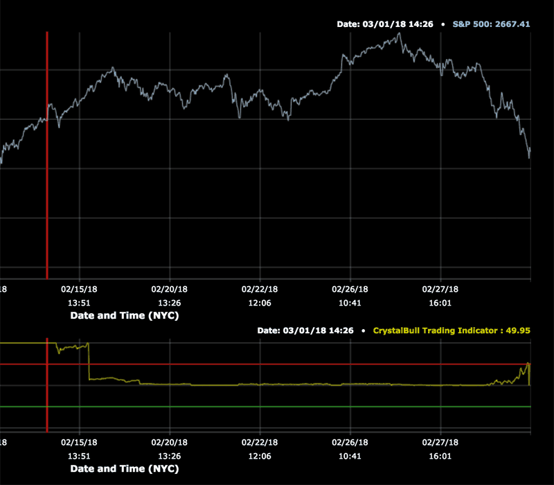
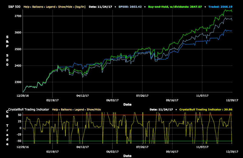
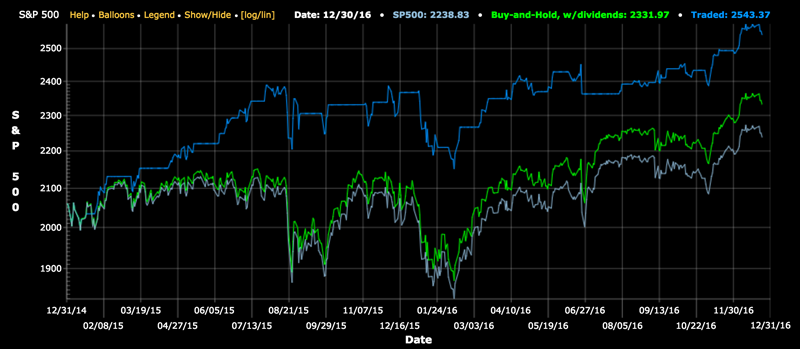
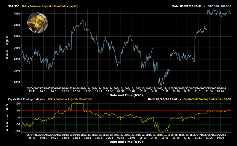
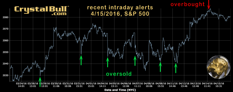
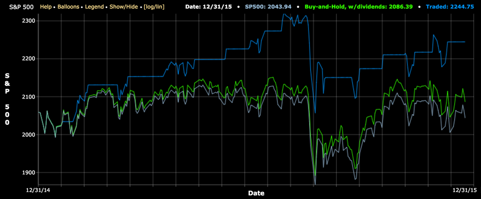

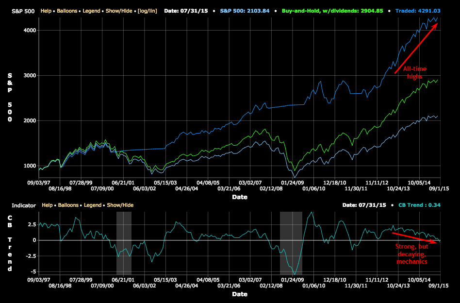
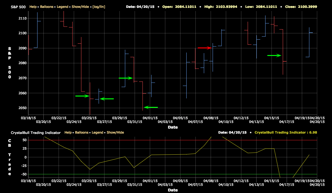
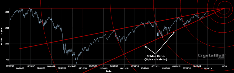
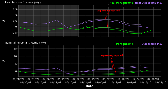
Each week, we scan the universe of U.S. stocks, and use AI find those with the best fundamental and technical characteristics for your review. These are great growth stock candidates for those who like to pick individual stocks. Let us know how your picks performed!
Click Here to view this week's picks: Weekly Stocks to Watch